Dreaming in Black-and-White
An informal survey of modern monochrome motion pictures that took advantage of the format’s unique abstract attributes.
Such recent high-profile projects as Mank, El Conde and Ripley (respectively photographed by ASC members Erik Messerschmidt, Ed Lachman and Robert Elswit) brought renewed attention to shooting in black-and-white for creative purposes. Several other notable recent projects — including Oppenheimer; Killers of the Flower Moon; Maestro, Blonde and Poor Things (shot by Hoyte van Hoytema, ASC, NSC, FSF; Rodrigo Prieto, ASC, AMC; Matthew Libatique, ASC, LPS; Chayse Irvin, ASC, CSC; and Robbie Ryan, BSC, ISC) also employed significant monochrome imagery to illustrate specific story points and establish desired emotional tones.
“It's simply not possible to get the same kind of halftones in color that you can in black-and-white.”
— Robert Surtees, ASC
At the beginning of cinema in the 1890s, all motion pictures were shot in black-and-white, but many included tinted imagery achieved with various processes and techniques, often to great creative accomplishment. In 1899, British inventor Edward Raymond Turner created a system that would become Kinemacolor, the first commercially successful color process, introduced in 1909. Many other color systems followed, reaching an apex with the introduction of three-strip Technicolor in 1932 (which still used black-and-white stocks to to capture red, green and blue records for later assembly in printing).
Before the the first true color motion-picture emulsions were introduced by Eastman and Agfa in the mid-1930s, shooting in color was expensive due to the complex, cumbersome equipment and slow film stocks available at the time. So the use of color photography grew only gradually, and was generally reserved for big-budget studio projects. As a result, unlike the abrupt transition from the Silent Era to Talkies, the move from black-and-white to color was a slow process, also in part as some leading cinematographers of the day — including Gregg Toland, ASC — avoided using color when possible, as even the best processes did not render what they felt was a true representation of the natural world.
First presented in 1929 by the Academy of Motion Picture Arts and Sciences, the Academy Awards included a category to honor excellence in camerawork — the key creative attribute that differentiates cinema from all other art forms.
Throughout this evolution, black-and-white remained a creative choice, but once full-spectrum motion-picture photography began to be employed to great effect in feature films, the Academy started presenting “Special Achievement in Color Cinematography” honorary Oscars to acknowledge these efforts. In 1936, the first was earned for the adventure drama The Garden of Allah, shot in three-strip Technicolor by ASC members W. Howard Greene and Harold Rosson. The following year, Greene earned the second such honor for A Star Is Born. The year after, ASC members Oliver T. Marsh and Allen M. Davey shared the next for the Sweethearts. A trend was quickly set.
In 1939, the Academy established a separate Oscar category to independently honor color cinematography, with ASC members Ernest Haller and Ray Rennahan sharing the first such award for Gone with the Wind. But this two-award practice ended in 1967, when it was deemed that there were too few eligible films shot in black-and-white to have a competitive race, making Haskell Wexler, ASC the last cinematographer to accept this unique Oscar, for Who’s Afraid of Virginia Woolf?
A tipping point had been reached. Soon, studio marketing efforts and audience tastes began to affect the filmmakers’ creative option to shoot in color or black-and-white — at this point the latter often only selected for purely budgetary reasons. As a result, the format largely faded from popular use, though still admired and even desired by filmmakers seeking what had become an “unorthodox” visual approach.
“I hate to see it go completely,” said Robert Surtees, ASC when talking to AC about his black-and-white photography in The Last Picture Show (1971) — the format demanded by his first-time director, Peter Bogdanovich. “I think we've lost a great tool, because it's absolutely right for certain types of stories. It's like the difference between a painting and an etching. The work that Arthur Miller [ASC] used to do in black-and-white, for example — it was like an etching. Just beautiful art. It's simply not possible to get the same kind of halftones in color that you can in black-and-white.”
Not incidentally, Bogdanovich’s subsequent feature, Paper Moon (1972), was also shot in black-and-white, by Laszlo Kovacs, ASC.
The diminishing use of black-and-white is reminiscent of the more recent transition to digital capture for the preponderance of motion-picture projects, as its attributes were leveraged to attain marketplace dominance. Fortunately, however, motion-picture film remains a vital, vibrant production option, yet, ironically, digital has led to increasing experimentation in black-and-white.
What follows is a curated sampling of feature films that took advantage of the unique attributes of black-and-white cinematography for the stories the filmmakers sought to bring to the screen.
“Where in the ‘book of rules’ does it say, ‘Make all motion pictures in color’?
— Gerald Hirschfeld, ASC
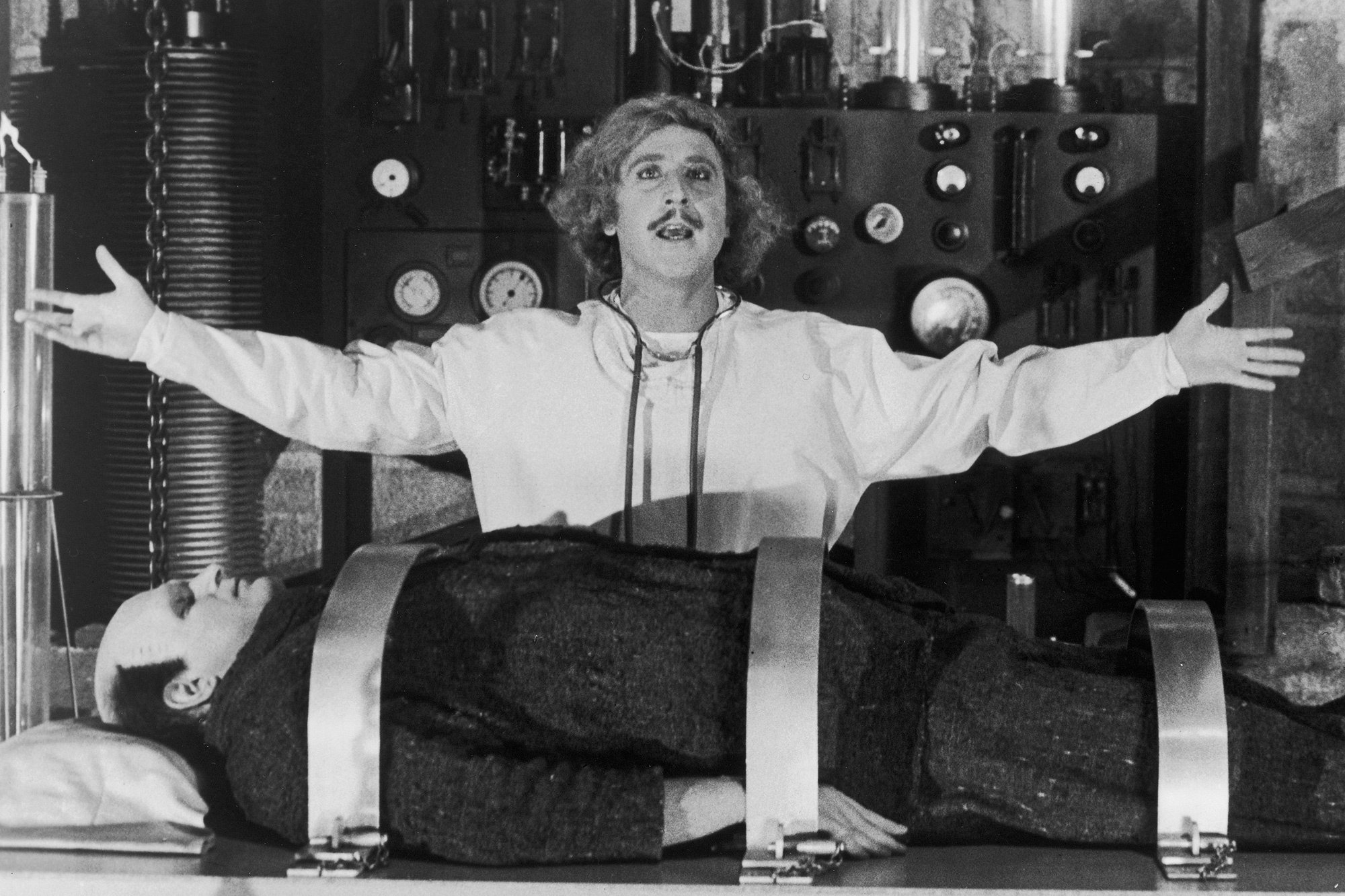
Young Frankenstein
Dr. Frankenstein (Gene Wilder) gives life to his Monster (Peter Boyle) in the hit comedy Young Frankenstein (1974), directed by Mel Brooks and shot by Gerald Hirschfeld, ASC. “At first, I balked at the decision to do the film in black-and-white, suggesting that perhaps we start in black-and-white, as the film opens in old-time Transylvania, and then segue into color,” Hirschfeld wrote in American Cinematographer. “But Mel was firm, and I soon realized that he was 100% correct. We are, in a sense, all victims of advertising and, at present, reject the use of black-and-white films as archaic. But where in the ‘book of rules’ does it say, ‘Make all motion pictures in color‘? I found, after viewing a few days of dailies, that the black-and-white not only seemed right, but it enhanced the feeling and mood of Young Frankenstein.”
“Black-and-white has this paradoxical, transcendental quality.”
— Haris Zambarloukos, BSC, GSC
Belfast
Directed by Kenneth Branagh and shot by Haris Zambarloukos, BSC, GSC, the period drama Belfast (2021) depicts the tumultuous time of “the Troubles” in Northern Ireland. Shooting in black-and-white was a joint decision. Zambarloukos told American Cinematographer, “As we started working together on the project, I asked, ‘I’m assuming we’re shooting in black-and-white?’ and Ken said, ‘Of course — but with a little color.’” The film opens with some color scenes of Belfast as the city appears today, and scenes showing characters escaping their world for a couple of hours to watch a film in a movie theater were also shot in color, playing on the contrast of reality and fantasy. “Black-and-white has this paradoxical, transcendental quality — it’s descriptive without giving you everything. You can show how people feel. The biggest part is removing the descriptive qualities of color and concentrating on the human condition. It creates a more honest portrait than color can.”
Zambarloukos earned an ASC Award nomination for his work, among other accolades.
“You get nine shades of gray [using the Zone System]. You’re in a totally different environment. It’s all abstract.”
— Ken Kelsch, ASC
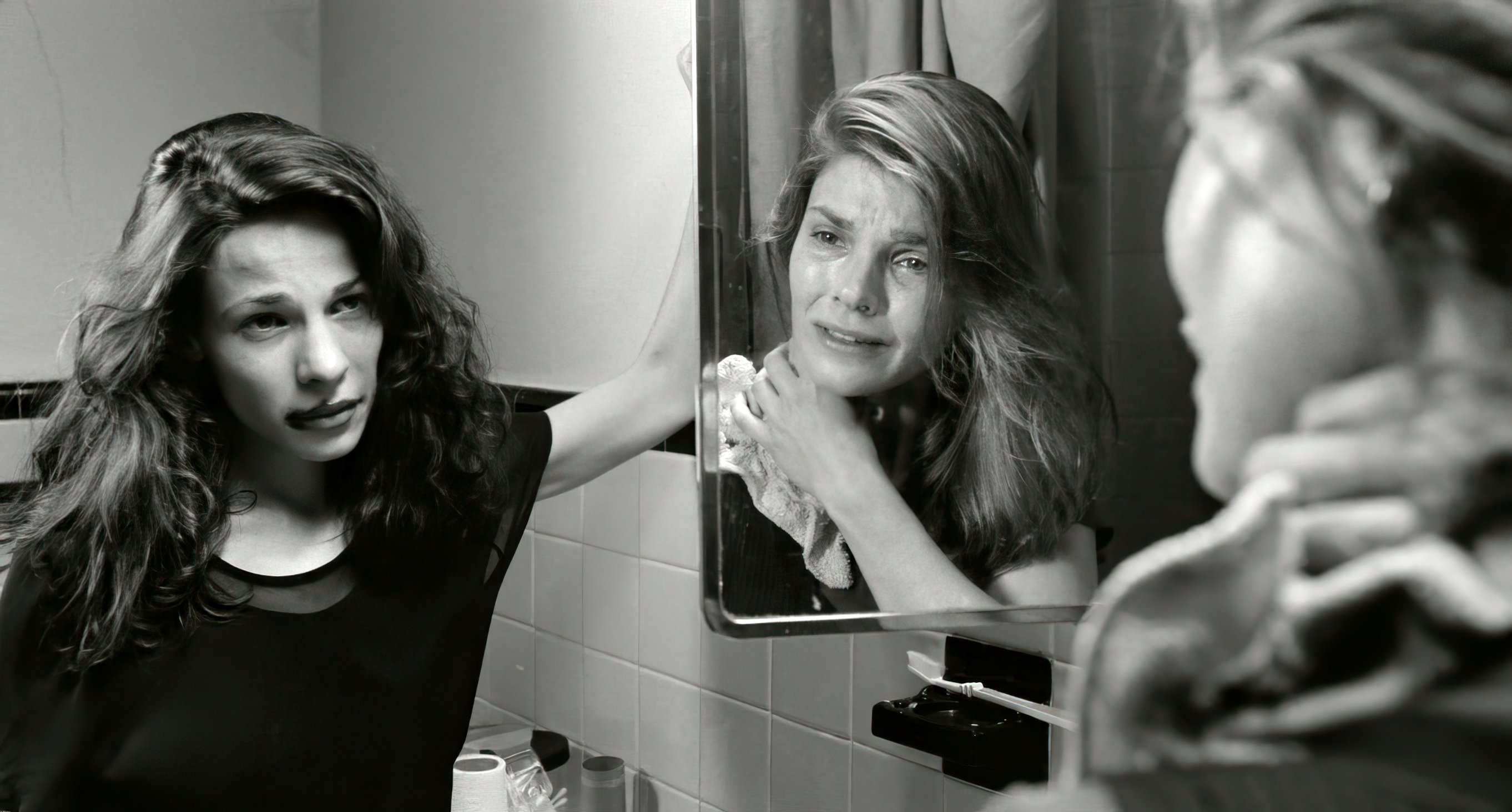
The Addiction
Captured in high-contrast monochrome, the indie supernatural drama The Addiction (1995), directed by Abel Ferrara, focuses on an NYU grad student (Lili Taylor) afflicted with vampirism who, in this scene, attacks a fellow student (Kathryn Erbe). “The film was a metaphor for a life of addiction,” said Ken Kelsch, ASC. “It’s my favorite film. To shoot black-and-white as a DP is great. You get nine shades of gray [using the Zone System]. You’re in a totally different environment. It’s all abstract. As a DP, I consider myself a source-driven minimalist unless I am going to make a stylistic leap where it’s going to be all stylized.”
“It’s so hard to articulate what black-and-white does compared to color. It’s partly abstraction, partly just how you enter the texture of the piece.”
— Bruno Delbonnel, ASC, AFC
The Tragedy of Macbeth
In the highly stylized The Tragedy of Macbeth (2021) — directed by Joel Coen and photographed by Bruno Delbonnel, ASC, AFC — one of the things that eliminated realism immediately was the choice to shoot in black-and-white, which alerts the viewer to look at the film differently. “It’s so hard to articulate what black-and-white does compared to color,” Coen told American Cinematographer. “It’s partly abstraction, partly just how you enter the texture of the piece. Black-and-white completes certain visual ideas without having to build them in.”
Delbonnel explained, “An important reference for us was Carl Theodor Dreyer’s The Passion of Joan of Arc [1928, shot by Rudolph Maté, ASC], with its many close-ups. I didn’t want to be ‘nostalgic’ about old black-and-white movies — quite the opposite. I was looking for the intensity that a very sharp image gives to close-ups.”
Delbonnel earned ASC Award and Oscar nominations for his work.
“Naturally, I said it would be great.”
— Robert Surtees, ASC
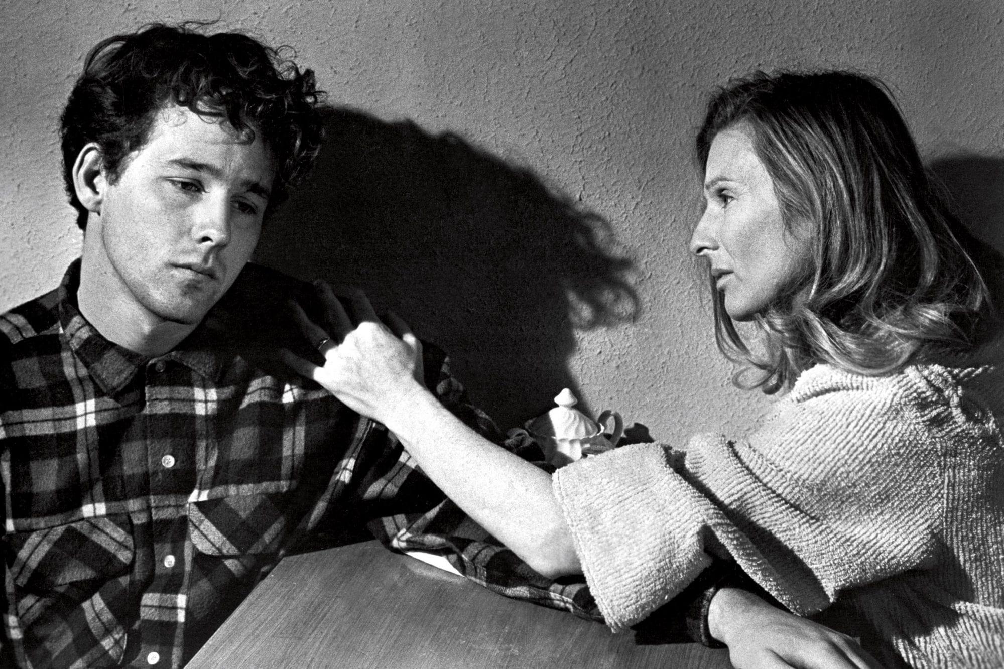
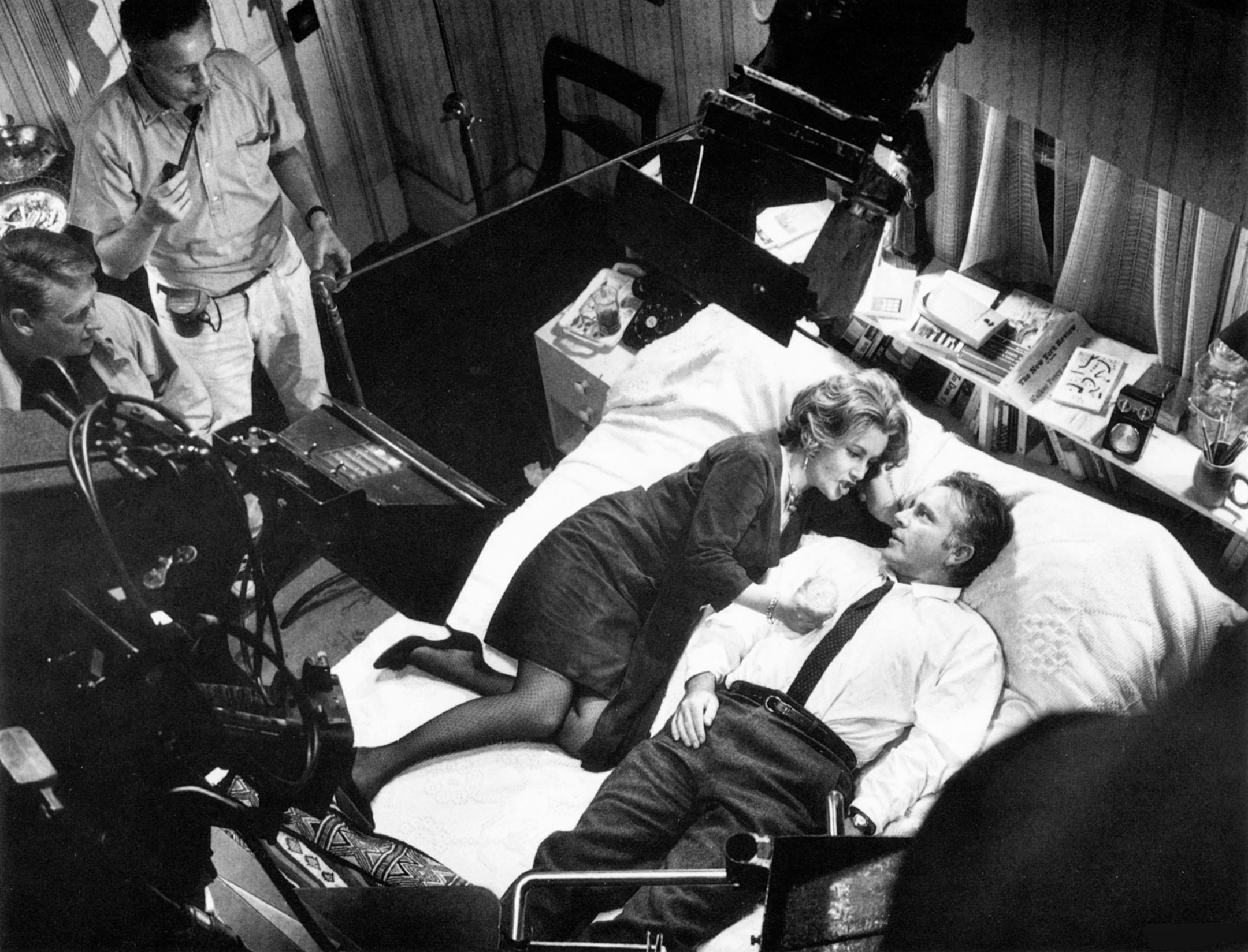
The Last Picture Show
The searing small-town drama The Last Picture Show (1971) — starring Timothy Bottoms and Cloris Leachman (pictured) — was the first feature in many years that Robert Surtees, ASC shot in black-and-white. “The idea of shooting in black-and-white came from the director, Peter Bogdanovich,” he told American Cinematographer. “He is a great admirer of John Ford and Orson Welles and has written books about both of them. He especially liked Citizen Kane, and in our preliminary meetings, before I was assigned to the picture, he asked what I thought about shooting his picture in black-and-white. Naturally, I said it would be great. Gosh, I don't know how many years it's been since I've done a black-and-white picture.”
Surtees earned an Oscar nomination for his efforts.
“Although we discussed the styles and techniques of [ASC members] Conrad Hall and Gregg Toland, we primarily studied their work to see how style could create mood.”
— Janusz Kamiński
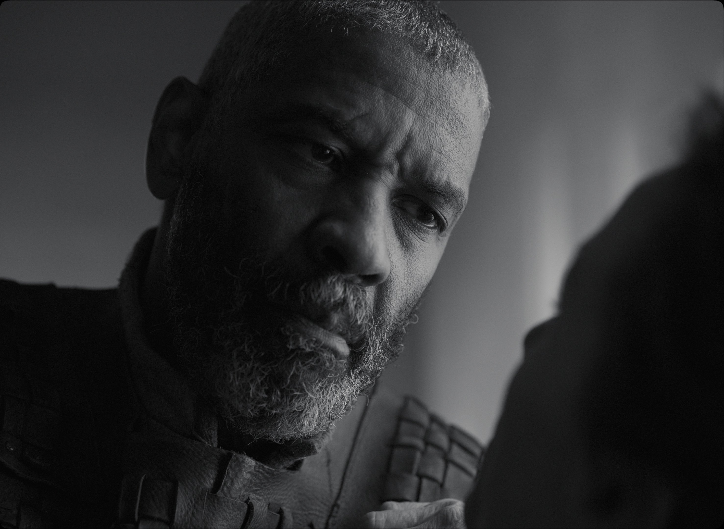
Schindler’s List
Janusz Kamiński knew for a year and a half that he would shoot the true-life World War II drama Schindler’s List (1993), starring Liam Neeson and Ben Kingsley (pictured), for director Steven Spielberg. The cinematographer used the time to learn more about black-and-white photography by studying books from that era. “I used A Vanished World by Roman Vishniac as sort of my bible,” Kamiński told American Cinematographer. “He photographed Jewish settlements in the period between 1920 and 1939. I found inspiration in that book because Vishniac had nothing — inferior equipment, inferior film stock and only available light — yet he managed to create beautiful pictures with a timeless quality.”
During prep, the director and cinematographer screened such black-and-white films as In Cold Blood and The Grapes of Wrath. Kamiński pointed out that “although we discussed the styles and techniques of [ASC members] Conrad Hall and Gregg Toland, we primarily studied their work to see how style could create mood.”
Against studio hopes, the filmmakers decided Schindler’s List would be filmed in black-and-white, and Kamiński won the ASC Award and Oscar for his outstanding camerawork.
“It was a true black-and-white stock with every minute tone in between.”
— Freddie Francis, BSC
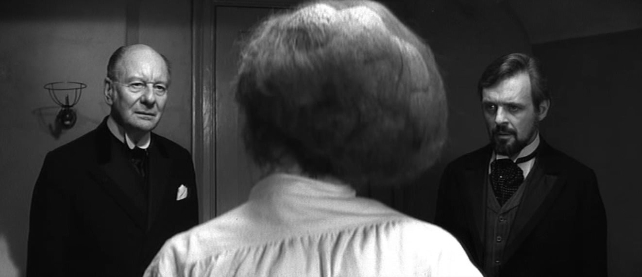
The Elephant Man
Director David Lynch gained attention with his singularly unique 1977 feature debut, Eraserhead. Impressed, Mel Brooks executive-produced his next film, The Elephant Man (1980), based on the true story of John Merrick, a 19th-century Englishman (John Hurt, pictured with co-star Anthony Hopkins) afflicted with a disfiguring disease. Brooks obtained permission from Paramount Pictures to shoot the Victorian-era film in anamorphic black-and-white. This combination of formats had not been utilized on a studio film for more than a decade, and cinematographer Freddie Francis, BSC had not shot a black-and-white feature in 15 years.
The Elephant Man was photographed in Panavision on Kodak Plus-X stock, the only monochrome emulsion that met Francis’ standards. He said, “My first impressions were that [Plus-X] had increased in speed and that the grain had diminished to such an extent as to be negligible … but, above all, it was a true black-and-white stock with every minute tone in between.”
Francis won the BSC Award for his camerawork.
“Whether you’re shooting color or black-and-white, if you don’t have a black reference, you don’t have the bottom.”
— Stephen H. Burum, ASC
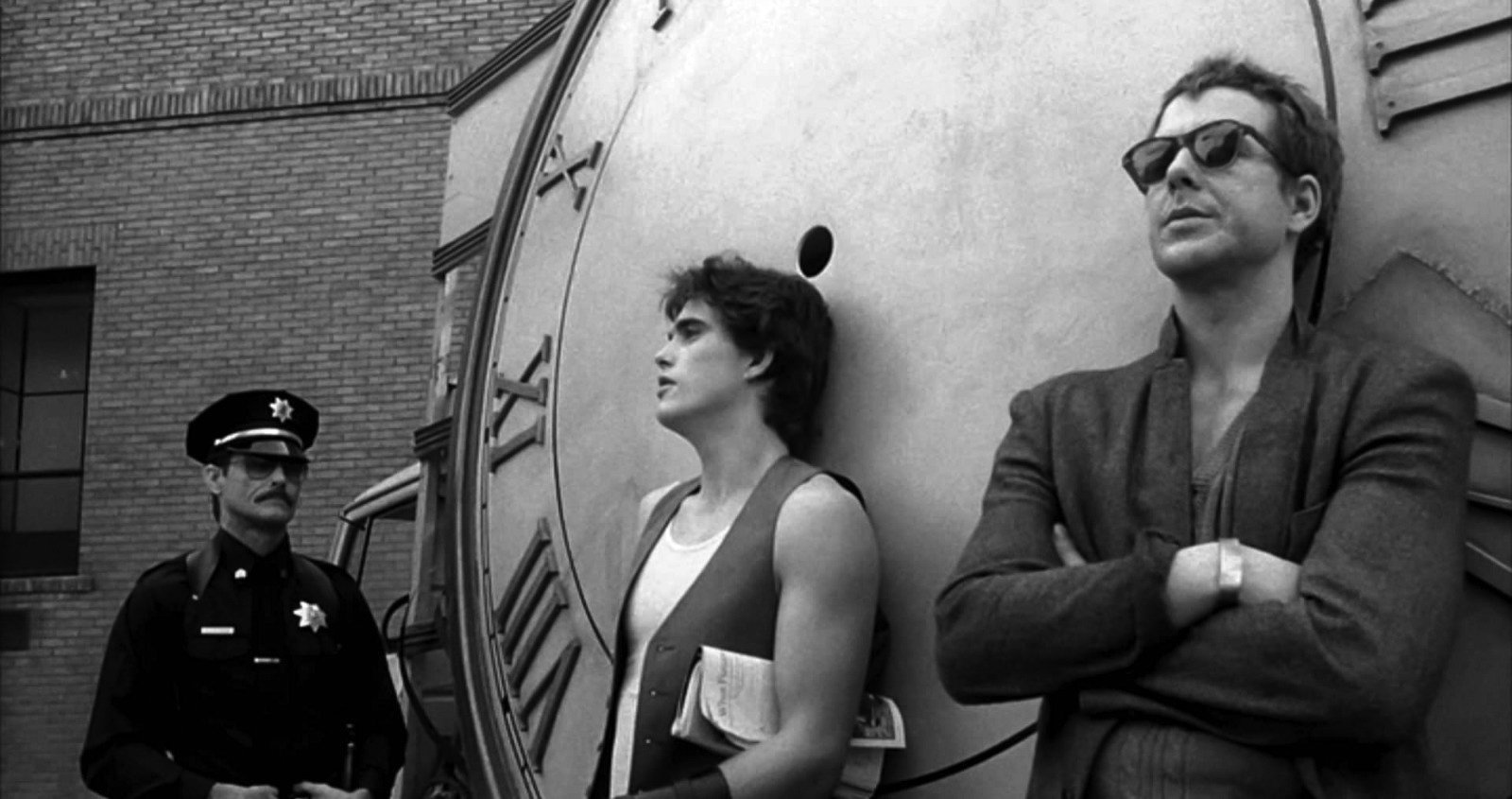
Rumble Fish
Directed by Francis Ford Coppola, Rumble Fish (1983) surprised audiences with provocative monochrome cinematography courtesy of Stephen H. Burum, ASC. In this photo, delinquent Rusty James (Matt Dillon) is flanked by Patterson the Cop (William Smith) and his rebellious older brother, Motorcycle Boy (Mickey Rourke). Asked about his high-contrast technique, Burum told American Cinematographer, “All processing was normal; however, it was developed to a higher gamma so we’d have a really good, solid blacks. To me black is a very important element. Whether you’re shooting color or black-and-white, if you don’t have a black reference, you don’t have the bottom. Especially when you’re shooting black-and-white, you always have to have a black reference in the frame as well as the highlight reference. If you don’t have all that, the gray scale in between just looks like gray mud.”
The film Decision Before Dawn (1951; shot by Franz Planer, ASC) was a key visual reference for the “ruined” landscape of Rumble Fish.
“We wanted it to look as if somebody from Life or Look magazine went into the CBS News studio with a 35mm rangefinder camera and just started taking stills."
— Robert Elswit, ASC
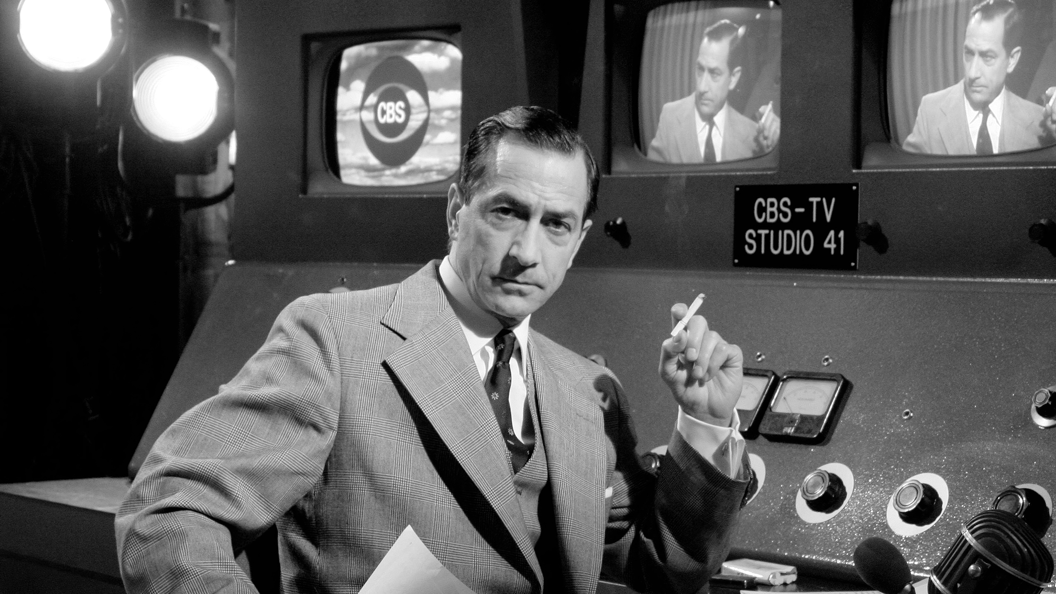
Good Night, and Good Luck
A portrait of TV newsman Edward R. Murrow and the political impact of his program See it Now, the period drama Good Night, and Good Luck (2005) was directed by George Clooney and shot by Robert Elswit, ASC. “We wanted it to look as if somebody from Life or Look magazine went into the CBS News studio with a 35mm rangefinder camera and just started taking stills," Elswit told American Cinematographer. That called for black-and-white. After many tests, practical considerations led Elswit to shoot on a color negative (Kodak Vision2 500T 5218) and then use Kodak's 2302 black-and-white print stock. To accomplish this, “[We] had to make a new color Estar neg because the contrast and density parameters are different for black-and-white printing. The resultant print very closely resembled the look of Plus-X 5231 that we'd all liked from the beginning.”
Elswit earned ASC Award and Oscar nominations for his work.
“I didn’t want to have even the notion of color in the process, including location scouting and casting.”
— Alfonso Cuarón
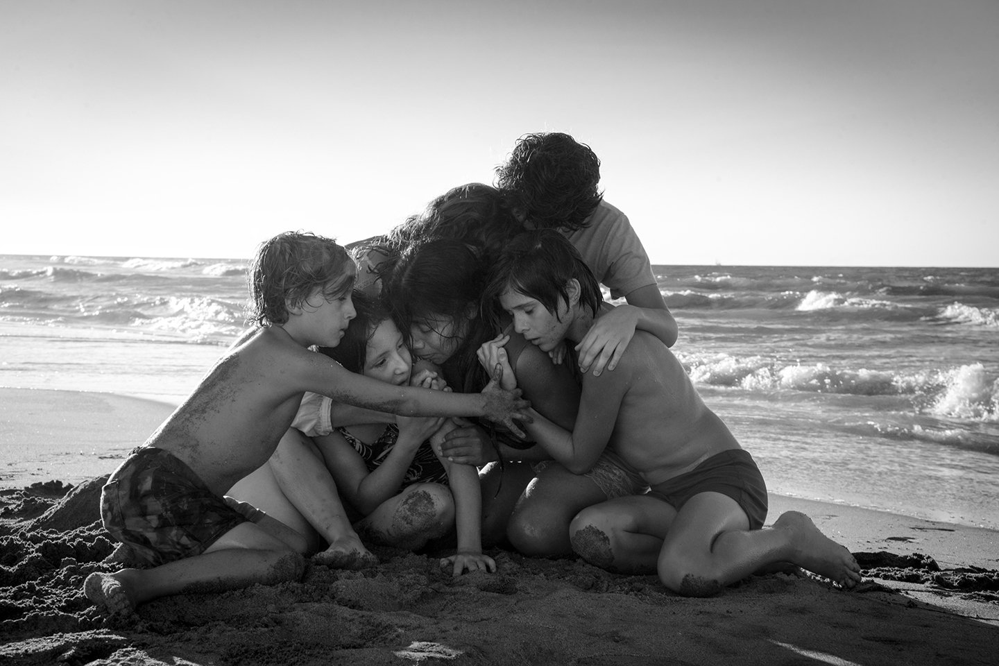
Roma
Director and cinematographer Alfonso Cuarón spent six months in prep on his autobiographical period drama Roma (2018), knowing from the start that he wanted his movie to be black-and-white. He and friend and collaborator Emmanuel Lubezki, ASC, AMC tested various film and digital cameras before Cuarón decided to shoot in color on Arri’s Alexa 65 and then desaturate the images in post. “I wanted a digital black-and-white,” Cuarón told American Cinematographer. “I wanted a film shot today in black-and-white and looking into the past. I would refrain from that classic, stylized look with long shadows and high contrast and go into a more naturalistic black-and-white. I didn’t want to try to hide digital in a ‘cinematic’ look, but rather explore a digital look and embrace the present.”
Cuarón won the Oscar for Best Cinematography and earned an ASC Award nomination for his work.
“On a project like this, there’s an element of, ‘Okay, how do we get that classic black-and-white look?’”
— Erik Messerschmidt, ASC
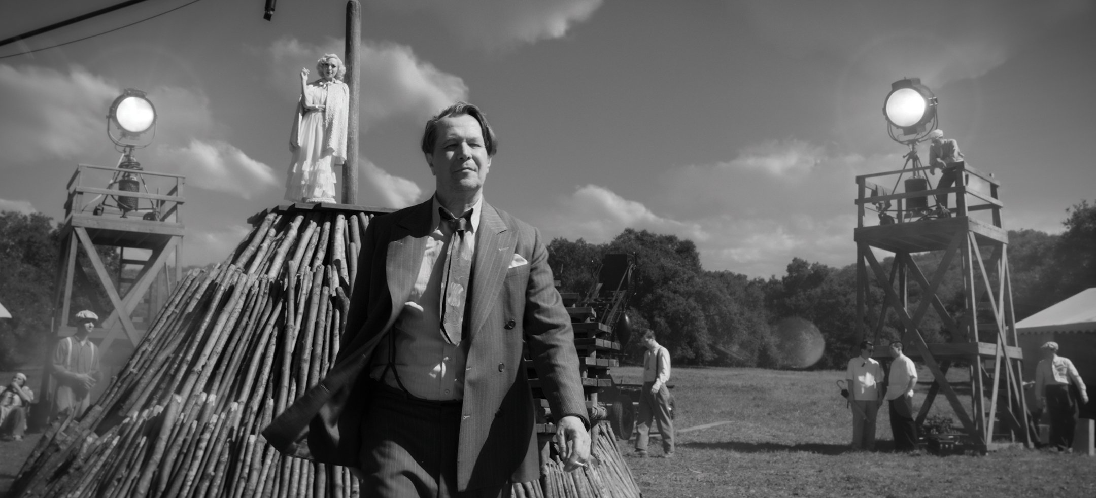
Mank
Directed by David Fincher and shot by Erik Messerschmidt, ASC, the period drama Mank
(2020) details the writing of the script for Citizen Kane by scenarist Herman J. Mankiewicz and his collaboration with Orson Welles. Fincher determined from the beginning that the picture would be shot in black-and-white. “On a project like this, there’s an element of, ‘Okay, how do we get that classic black-and-white look?’’ Messerschmidt told American Cinematographer. “But you first have to ask, ‘What are we making?’ So I started to think about what a black-and-white movie looks like, and I had naively only considered film noir because that’s what cinematographers are naturally attracted to. I sent David some images to consider, and he said, ‘Yes, there’s some room for this.’ But as I started to go back and watch more black-and-white films, I immediately realized how narrow-minded my initial inclination was. I pulled lots of references: The Night of the Hunter, Rebecca, The Apartment, In Cold Blood, et cetera. The Grapes of Wrath is a movie that takes place in a lot of environments like one of the main settings in Mank. I started pulling more references like that because Mank is not a gumshoe noir thriller.”
Messerschmidt won the ASC Award and Oscar for his work, among other honors.
“I couldn’t think of a color that would make sense.”
— Lukasz Zal, PSC
Cold War
Directed by Pawel Pawlikowski and shot by Lukasz Zal, PSC, the intimate period drama Cold War (2018) traces the romance of mismatched lovers Wiktor (Tomasz Kot) and Zula (Joanna Kulig). Here, a day exterior with Kulig is captured with a handheld Arri Alexa XT. Like their previous film, Ida, Cold War was shot in color and desaturated to black-and-white in post. Also as with Ida, the lighting, production design, costumes and background were designed for monochrome. Video village monitored the shoot in black-and-white. “I couldn’t think of a color that would make sense,” Pawlikowski said of Cold War in an interview with American Cinematographer. “There was no color in Poland in the 1940s and ’50s. It was all gray, brown and greenish. We played with the notion of shooting the picture [in a way that would approximate] the East German/Soviet stock ORWO, with its washed-out greens and reds, but I felt it would seem too mannered.”
Zal won the ASC Award and earned an Oscar nomination for his work.
“It was actually liberating to shoot black and-white because it’s inherently more abstract than color.”
— Michael Chapman, ASC
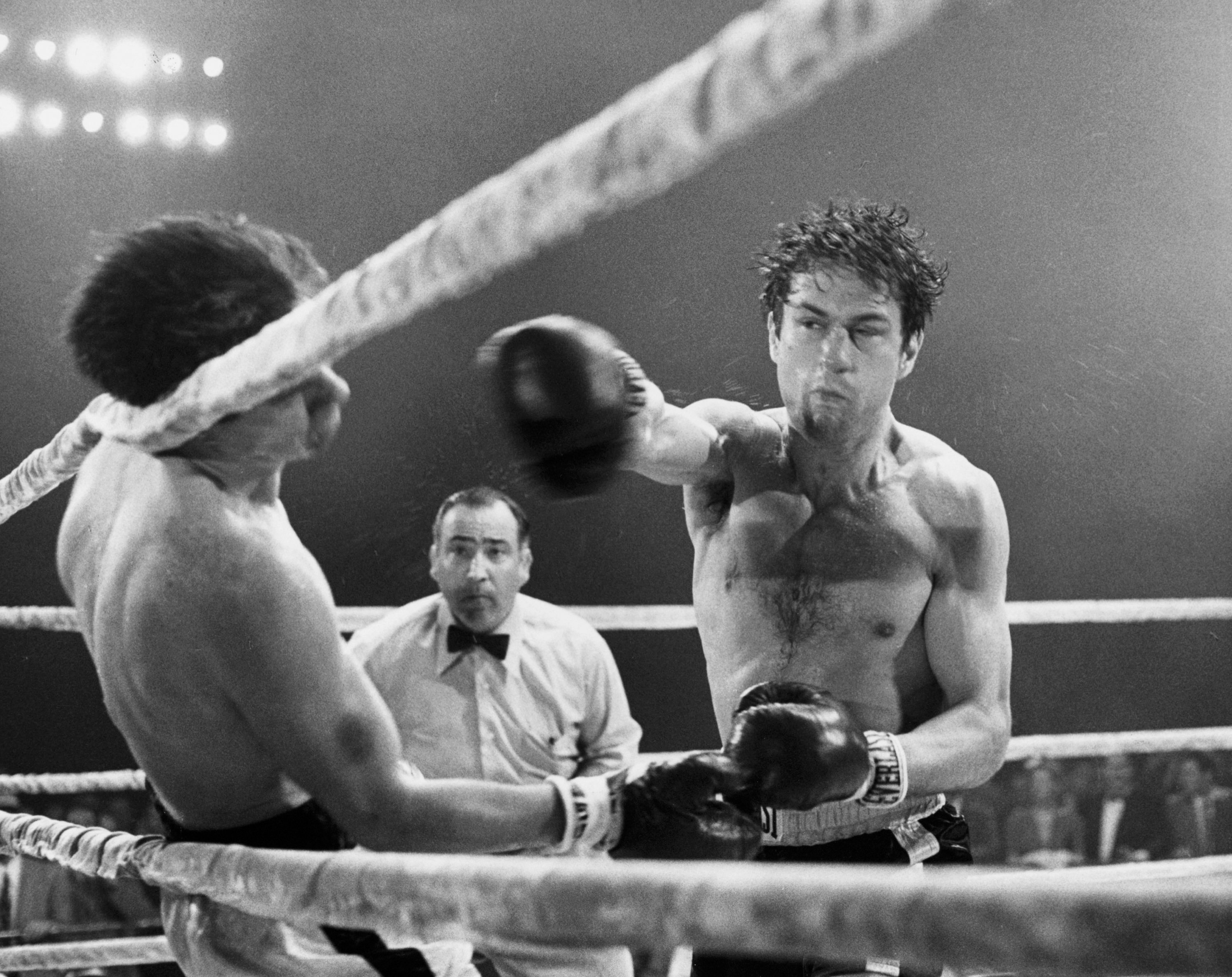
Raging Bull
For cinematographer Michael Chapman, ASC, shooting director Martin Scorsese’s Raging Bull (1980) in black-and-white served two key purposes. The picture was consciously photographed in the style of newspaper reportage; specifically, the work of Weegee (Arthur Fellig), calling for a high-contrast monochrome. Also, black-and-white would eliminate the graphic bloodiness of the fight scenes. He shot Raging Bull on Eastman Double-X, but his experience with the format was limited: “I knew in theory that you had to use backlight to separate [elements in the frame], and that you only had tones to work with. But I found that it was actually liberating to shoot black-and-white because it’s inherently more abstract than color. It’s one step removed from the reality of the red tie and the blue shirt. You start one step from reality, and from there, you can do pretty much whatever you want.”
Among other honors, Chapman earned an Academy Award nomination for his expert camerawork.
“There are all kinds of ways to shoot the city of New York. In the case of Manhattan, the concept was to lay the picture out in what I call ‘romantic reality.’”
— Gordon Willis, ASC
Manhattan
One of the most iconic images in 1970s cinema, creating this shot for Manhattan
(1979), co-written and directed by Woody Allen, was a distinct creative challenge for Gordon Willis, ASC. He was shooting in Panavision anamorphic and black-and-white, as Allen’s mental image of the city was informed by monochrome stills seen in his youth. “There are all kinds of ways to shoot the city of New York,” Willis told AC. “In the case of Manhattan, the concept was to lay the picture out in what I call ‘romantic reality.’”
Willis earned a BAFTA nomination, among other honors, for his camerawork.
“Black-and-white film has a very particular texture; there are three-dimensional chunks of silver embedded in gelatin at different depths and sizes.”
— Jarin Blaschke
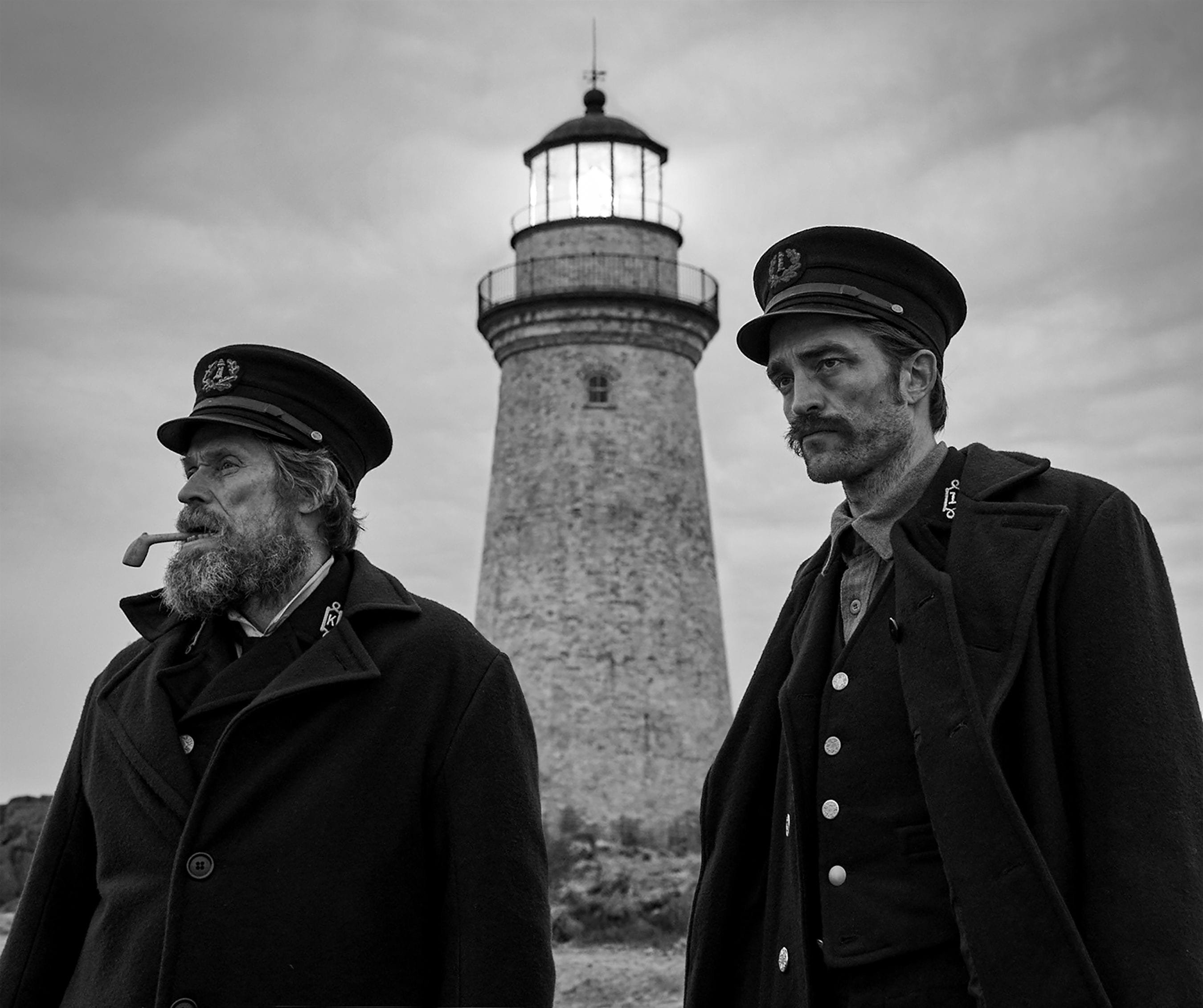
The Lighthouse
On page one of his earliest drafts, writer-director Robert Eggers wrote that The Lighthouse was to be shot on 35mm black-and-white film stock.
“Years ago, when Rob first teased the idea for The Lighthouse across his kitchen table, all I knew was that it was going to be two men, a tight space, a tight aspect ratio, madness, occasional flatulence, and ‘black-and-white with a cherry on top,’” cinematographer Jarin Blaschke told AC. “I took that to mean he wanted to be unapologetically old-fashioned and to transport the audience to another world. Black-and-white is good for that. It’s instantly abstract.”
But why not shoot color, and then change it in post? “Early on, while The Witch was stalling, The Lighthouse could have potentially been Rob’s first film,” Blaschke explained, referring to the 2015 supernatural tale that the pair also shot in black-and-white, but with Arri Alexa cameras. “We didn’t know what the [Lighthouse] budget would be. At one point, Rob asked if I thought a digital format could work for the black-and-white look he was after. As a longtime shooter of black-and-white still film, I didn’t think it would, since black-and-white film has a very particular texture; there are three-dimensional chunks of silver embedded in gelatin at different depths and sizes. It’s much more physical than even a color film image, which is made of tiny clouds of dye.
“For The Lighthouse, I performed some simple tests to address my suspicions. I shot 35mm Double-X, 35mm color film [5219], and with the Arri Alexa. Our assumptions were upheld. In addition to much larger grain, the Double-X had more ‘tooth.’ Even if you match the overall contrast in the DI, the Double-X had more ‘local’ or ‘micro’ contrast, which emphasizes texture and better differentiates similar tones.”
Blaschke earned the ASC Spotlight Award for his work, as well as an Oscar nomination, among other honors.
This list is by no means complete, and more than a few other favorites come to mind, including Psycho (1960, shot by John L. Russell, ASC), The White Ribbon (Christian Berger, AAC), Nebraska (Phedon Papamichael, ASC, GSC), Suture (Greg Gardiner), The Man Who Wasn’t There (Roger Deakins, ASC, BSC), Tetsuo: The Iron Man (Kei Fujiwara and Shin'ya Tsukamoto), The Artist (Guillaume Schiffman), Federal Hill (Richard Crudo, ASC), Passing (Edu Grau, ASC, AEC), Escape From Tomorrow (Lucas Lee Graham), A Girl Walks Home Alone at Night (Lyle Vincent), Malcolm & Marie (Marcell Rév, ASC, HCA), Ed Wood (Stefan Czapsky, ASC), and, of course, Eraserhead (Herb Cardwell and Fred Elmes).